EXCLUSIVE! This tutorial was originally created for my beautiful and cute wife learning about Python Data Visualization in some financial cases.
Well, this tutorial aims to finish THREE popular tasks concerning data analysis, data visualization and combining it into html file, aka. for the purpose of using the analysis elsewhere other than local computer.
Step 1: data analysis
1.1 fecth data
Since my wife is interested in financial area and curious about plotting beatiful and interactive k-lines, this tutorial will focus on build plot of such kind.
To fetch the data we want to plot with, we need to install a popular python package named tushare and sign up for a particular token which will be passed into the code for data fetching.
Use your account to log into the site for further steps. Meanwhile, open a prompt / powershell window, and install tushare package simply by typing pip install tushare, and then downloading and installing process will automatically start.
After log in to the tushare site, you need to navigate to the user center and find below the 接口Token panel and copy your token.
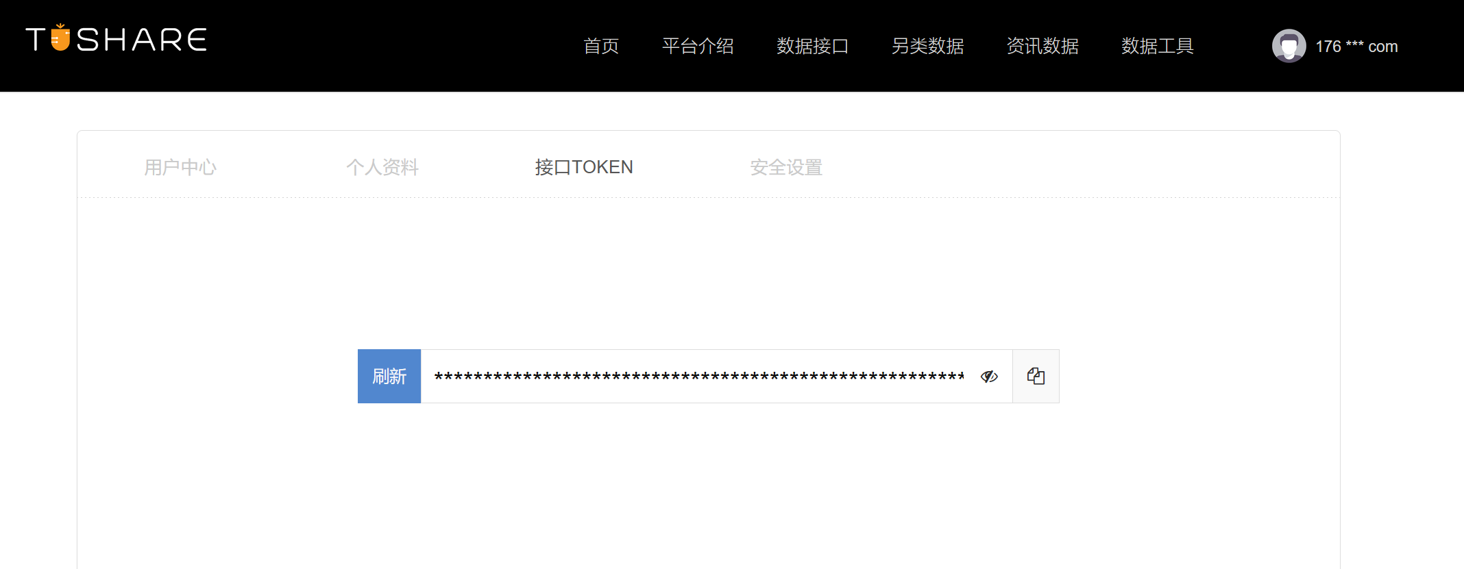
With the token you just found, you are now able to request data from tushare using the user-friendly api provided by them. You may not be familiar with what api is, but all you need to know about it is api is the first approach you should try if you want to fetch from a data source, and if it is not available, then other approached may be considered such as web crawler and manually downloading.
Below is the data fetching part of the code, quite simple. You could refer to the tushare website for more information about the basic usage of the tushare.pro_api function.
import tushare as ts
token = 'which you need to replace with your own token'
pro = ts.pro_api(token)
df = pro.daily(ts_code='600519.SH', start_date='20000101', end_date=20211027)
BTW, I love this magic liquid gold and I definitely will hold some stock of 600519.SH someday if I could afford to.
You may notice that pro.daily function returns a dataframe (here it is named as df). So, we could investigate some of its attributes and data structure of this dataframe. Like showing all of the columns contained in the dataframe
print(df.columns)
# Index(['ts_code', 'trade_date', 'open', 'high', 'low', 'close', 'pre_close','change', 'pct_chg', 'vol', 'amount'],dtype='object')
or the first rows of the Excel-like dataset
print(df.head())
'''
     ts_code trade_date     open  ...  pct_chg       vol       amount
0  600519.SH   20211027  1852.30  ...  -2.2595  34647.29  6302270.905
1  600519.SH   20211026  1864.03  ...  -0.6396  21130.26  3934223.714
2  600519.SH   20211025  1880.00  ...  -1.4713  32461.33  6076219.948
3  600519.SH   20211022  1855.00  ...   3.0911  35962.60  6794850.056
4  600519.SH   20211021  1841.10  ...   0.1630  23018.70  4238584.294
'''
1.2 preprocess the dataset
Now we are moving on. A simple convention for a dataframe containing an unique timestamp at each row is to use the timestamp as its index. And we noticed that the original data return by tushare contains a column named trade_date BUT it is not well parsed so it is not recognized as a column of timestamp by now. Moreover, the timestamps are not sorted increasingly, as we noticed the most recent dates are shown at the top rows. Based on the mentioned, we will use trade_date as the index of the datafram and convert the new index into the datatime format using pandas.to_datetime function and then we sort the index. Nice! The dataset is ready for plot
import pandas as pd
df.index = df['trade_date']
df.index = pd.to_datetime(df.index)
df.sort_index(inplace=True)
Step 2: Plot with Plotly
Plotly is a powerful tool producing interactive charts, and without question it has its python package. Install this package by typing pip install plotly into your terminal or shell.
2.1 produce a plot
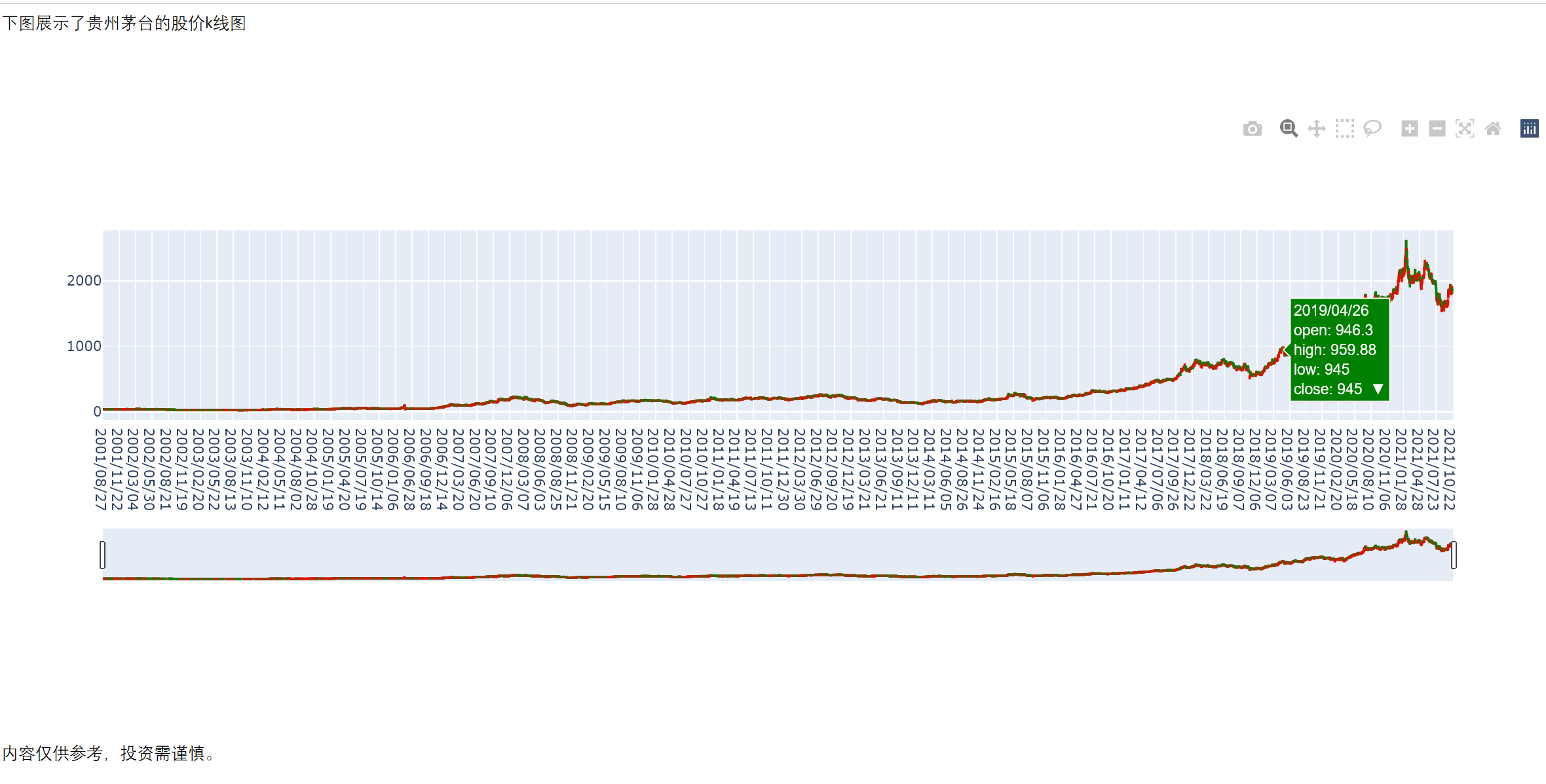
Don’t be freaked out by the code since it only contains the assignment to the varible fig and then fig is called by fig.show(). If you are lucky, then the default browser on your computer will automatically render a new tab for your plot. If you are not lucky, well, my wife can turn to me but you may turn to stackoverflow or CSDN
import plotly.graph_objects as go

fig = go.Figure(data=[
    go.Candlestick(x=df.index.strftime("%Y/%m/%d"),
                   open=df.open,
                   high=df.high,
                   low=df.low,
                   close=df.close,
                   increasing=dict(line_color='red'),
                   decreasing=dict(line_color='green')
                   )
])

fig.show()
You may have discovered that k-lines is acually a candlestick plot using open price, high price, low price, close price and the candle stick is composed as the picture below.

2.2 save the plot as a html file
After we need to export the plot into a html file so that we could embed it elsewhere. Simply use the following code:
fig.write_html('sample_plot.html')
and a file named sample_plot.html will be saved at the parallel path to the python code file you are using.
Step 3: use the plot at a html.
We know that construct a beautiful webpage requires lots of work. And for the occasions we only want to exhibit some text and pictures, MS Word is the first option.
We create a simple word document as shown in the picture below
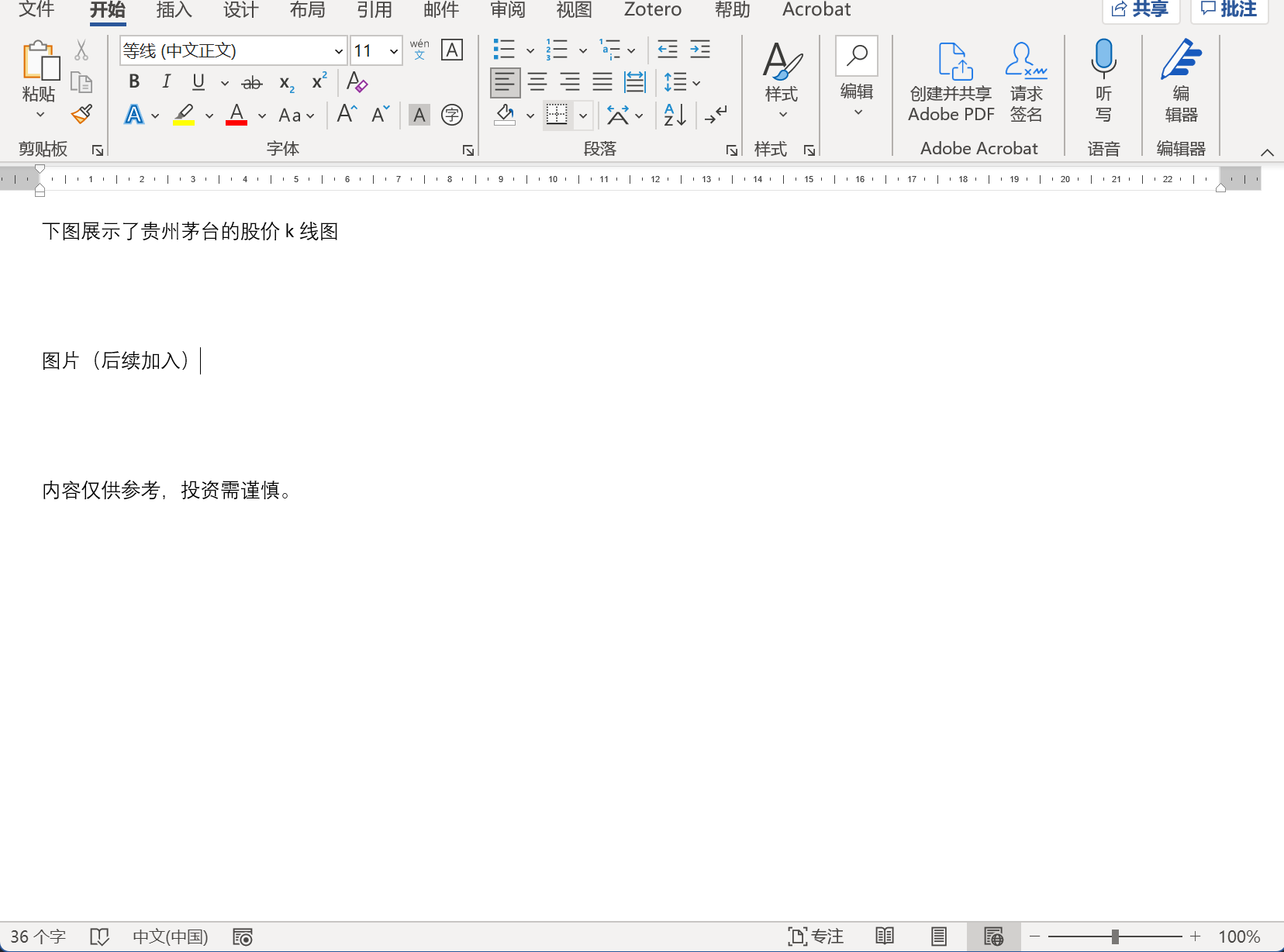
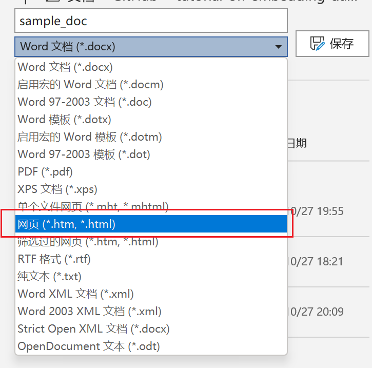
We then save the file as a html file by clicking 文件-另存为, and select the file type as illustrated.
And then use a text editor software to modify the doc, here we use Visual Studio Code for demonstration.
We navigate the position we want to insert the plot.
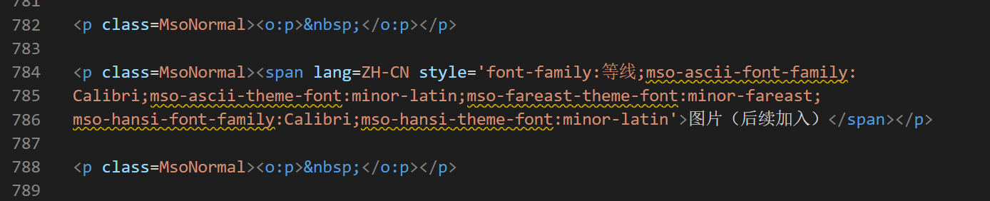
And we delete the text block and add the following code.
<iframe scrolling="no" style="border:none;" seamless="seamless"
src="https://qj4chen.github.io/sample_plot/"
height="500" width="100%">
</iframe>
And pay attention to the source here src="https://qj4chen.github.io/sample_plot/" . It means you need to create a github repository named sample_plot to host the page.
Then again, if you have question about this, feel free to consult to the web for solution. But if you are my wife, please ask me any time and I will fix it to you. Nevertheless, this post may be helpful.
Finally
Thanks to plotly and Github, we can now render our analysis to the Magic Liquid Gold in China vividly in our browser.